A Guide to Color Selection in Interior Design:
Introduction:
In the realm of interior design, color is the brushstroke that brings spaces to life, adding depth, character, and emotion to our homes. Choosing the right colors can transform a room from mundane to magnificent, evoking feelings of warmth, tranquility, or even excitement. In this blog post, we will embark on a colorful journey, exploring the art of color selection in interior design. Accompanied by vivid visuals, we will delve into various color schemes, their psychological impacts, and how they can be applied to different rooms in your home.
1. Understanding the Power of Colors:
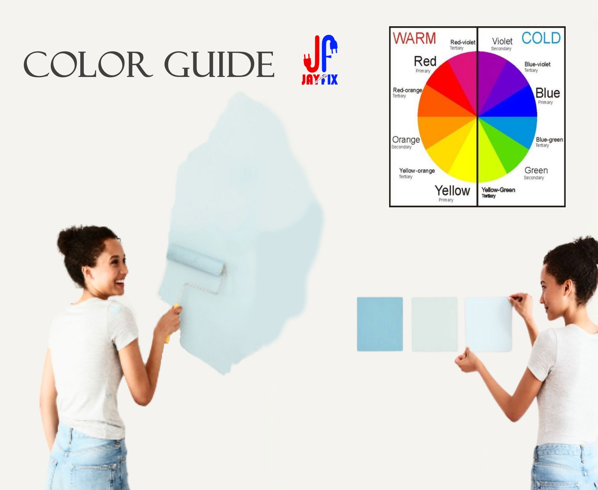
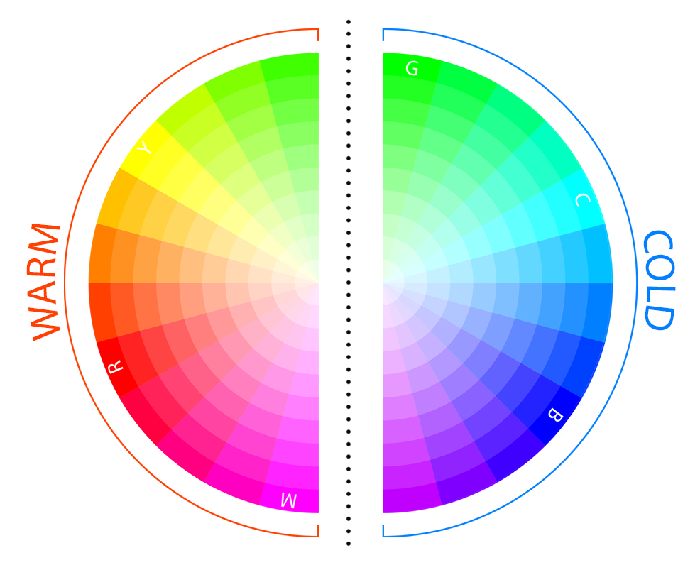
Colors are more than just pigments; they are emotional triggers. Warm tones like rich reds, glowing oranges, and golden yellows exude energy and intimacy, making them ideal for social spaces. Cool hues such as calming blues, refreshing greens, and soothing purples promote relaxation and focus, making them perfect for bedrooms and work spaces.!
2. Harmonizing Hues: Creating a Palette
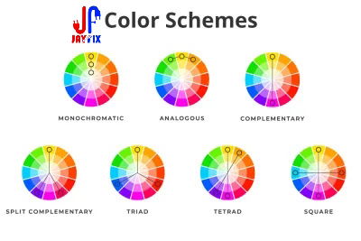
Creating a harmonious color palette involves understanding color schemes.
When designing a room, it's essential to create a cohesive color scheme. There are several methods to achieve this harmony:
- Monochromatic Scheme: This involves using different shades and tints of a single color. For example, various tones of blue can create a sophisticated and calming atmosphere.
- Analogous Scheme: Analogous colors are located next to each other on the color wheel, such as blue and green. This scheme offers a pleasing and harmonious look, perfect for creating a relaxed ambiance.
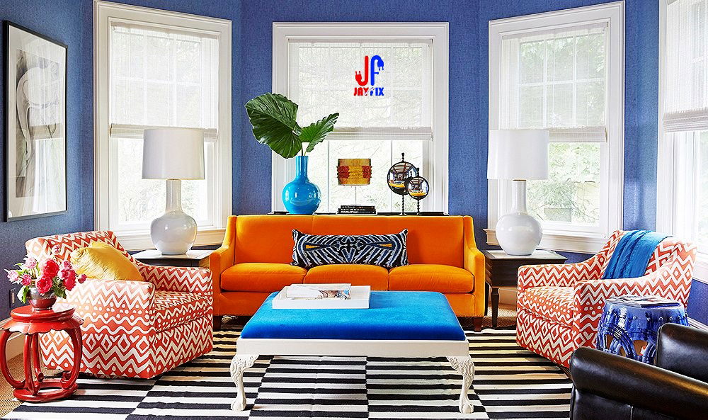
- Complementary Scheme: Complementary colors are opposite each other on the color wheel, like red and green or blue and orange. This scheme provides a vibrant contrast and adds excitement to a room.
- Split-Complementary Scheme: This scheme takes one base color and combines it with the two colors adjacent to its complementary color. For instance, pairing red with yellow-green and blue-green creates a balanced yet dynamic palette.
- Triadic Scheme: This scheme uses three colors that are evenly spaced around the color wheel, such as red, yellow, and blue. Triadic color schemes offer a high degree of contrast while maintaining color balance.
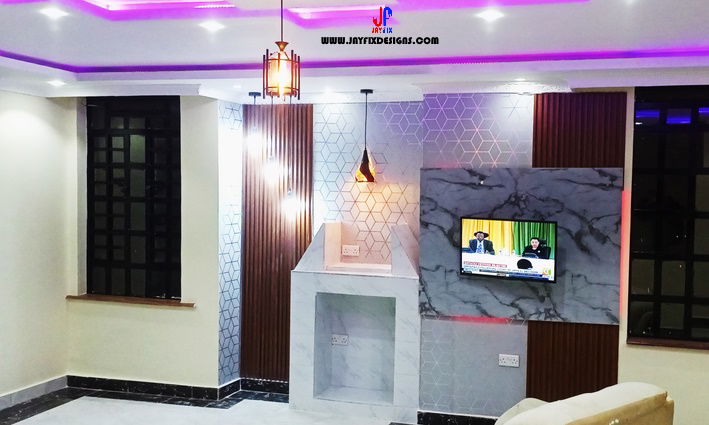
3. Room-by-Room Brilliance:
- Living Room: Embrace warm neutrals, accented with vibrant hues like deep blues or energetic yellows, creating a lively and inviting atmosphere for social gatherings.
>>More Living Room Images...<<
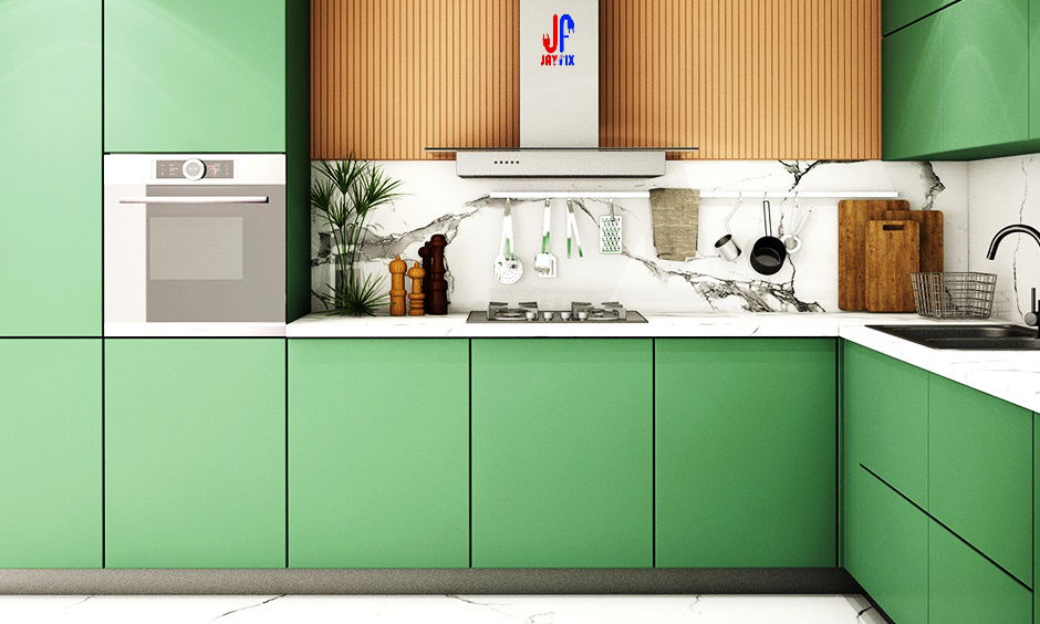
- Kitchen: Fresh greens and vibrant reds can stimulate appetite and add a touch of energy to your cooking space, making it a hub of creativity and warmth.
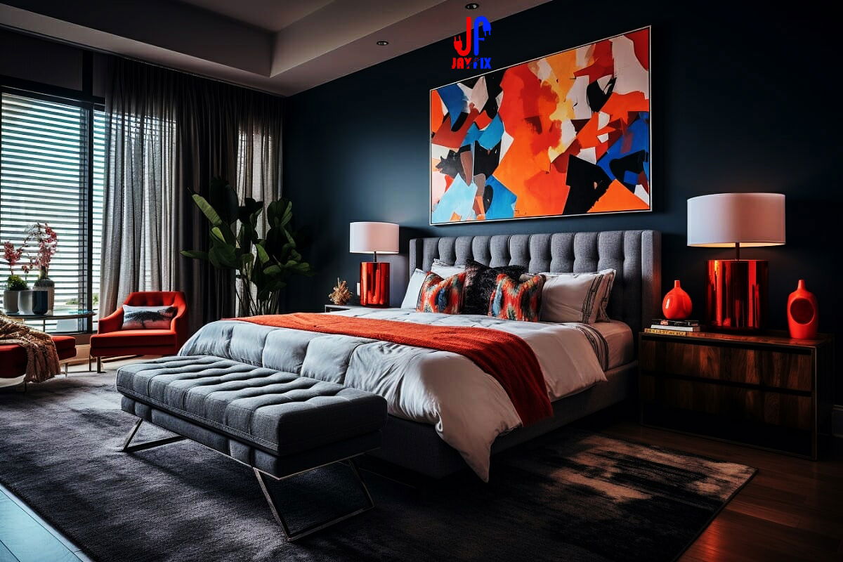
- Bedroom: Calming shades of soft blues, gentle greens, or muted purples can transform your bedroom into a serene sanctuary, promoting restful sleep and relaxation.
- Home Office: Opt for muted tones like soft grays or warm browns, promoting focus and productivity in your workspace while still providing a comfortable ambiance.
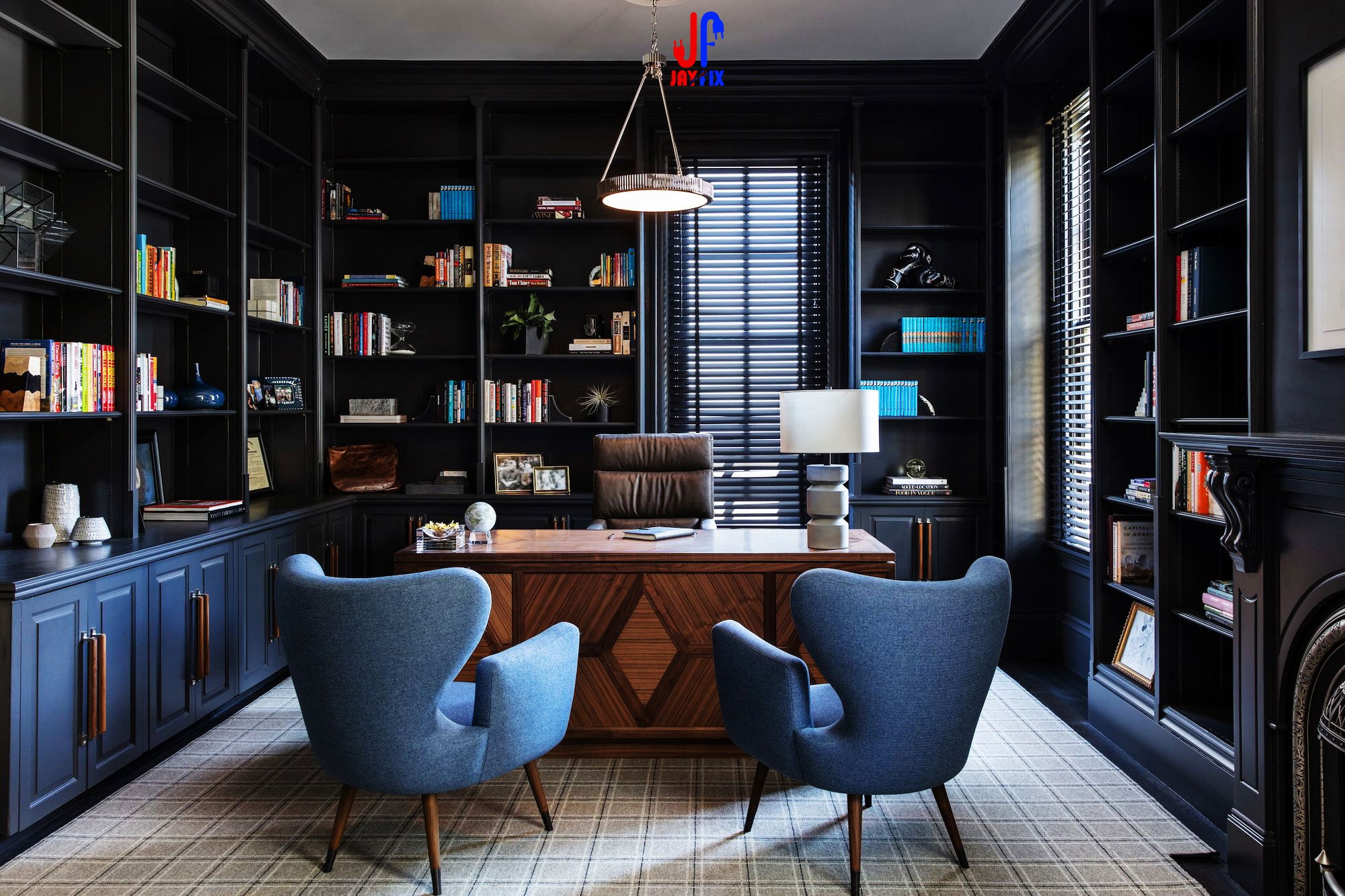
>>More Home Office Images...<<
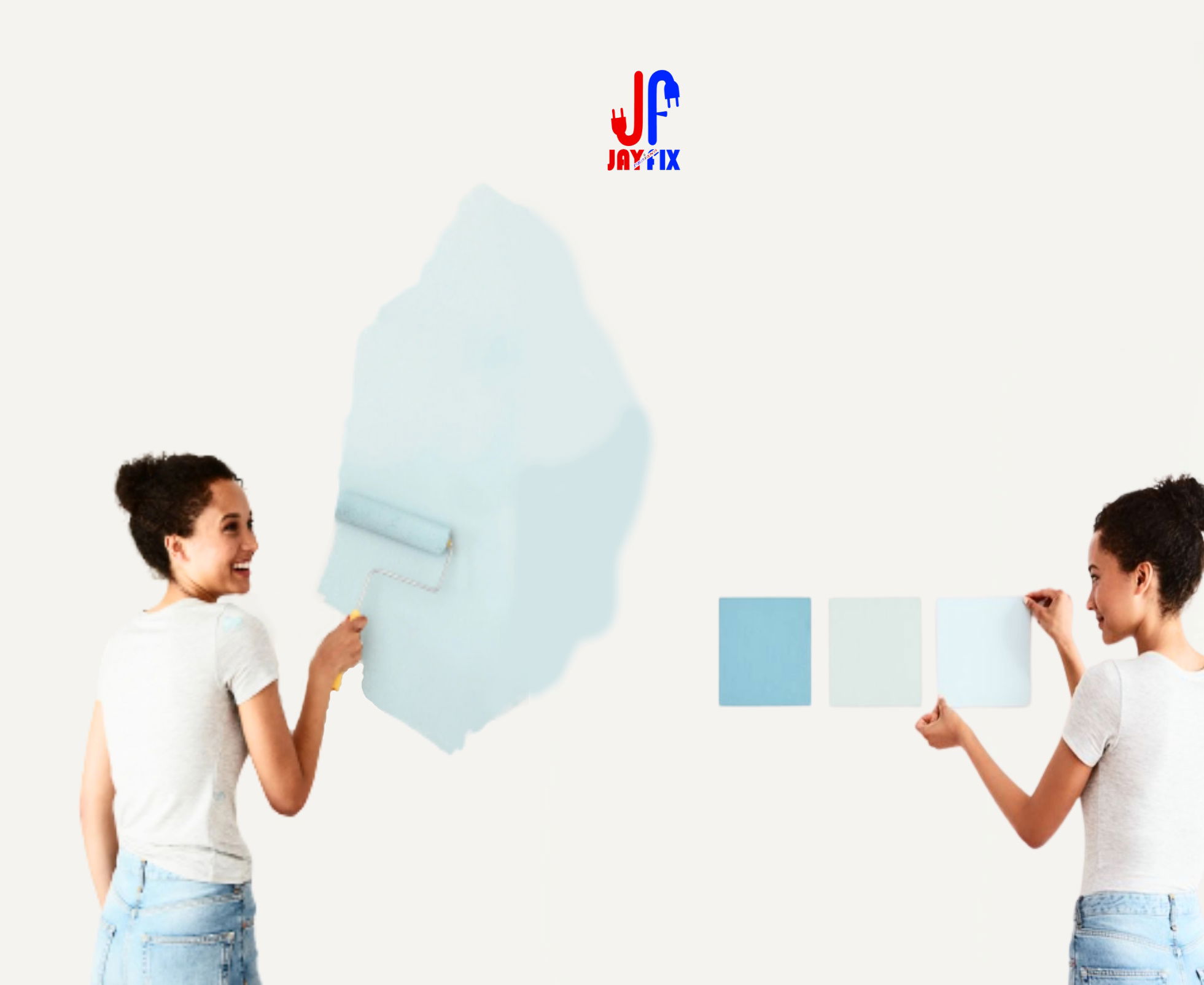
Before committing to a color scheme, always test your chosen colors in the actual space. Natural light, artificial light, and room size can affect how colors appear. Samples on different walls allow you to observe how they transform under various lighting conditions.!
Conclusion:
Your Palette, Your Style Color selection in interior design is a deeply personal journey, where your tastes and preferences shape the ambiance of your home. By understanding the psychological impact of colors and experimenting with different schemes, you can create spaces that resonate with your personality and style. So, grab that color wheel, let your creativity flow, and paint your world with the hues that speak to your soul. Your home is your canvas—make it a masterpiece!!
- Munyaka J-

Comments